New Balance Redefines Grey. A Classic in the Making
How New Balance turned an understated shade into a bold cultural statement
Grey. For most, it is the colour of compromise. Safe. Neutral. Forgettable. But New Balance has never been one for the obvious choice. Their latest brand activation flips the script, positioning grey not as background noise, but as the main event.
A Campaign Rooted in Heritage
The colour grey has been stitched into New Balance’s DNA for decades. It first appeared in the 1980s, when running shoes were expected to be bright, bold, and logo heavy. New Balance went the other way, embracing muted tones that felt premium, versatile, and timeless. Grey Has Never builds on that heritage not by looking back, but by re establishing why grey still matters today.
Part of what gives this activation its punch is collaboration. Enter Kith Treats, the New York based concept that mixes style, food, and street culture. By working with Kith Treats, New Balance did not just release a product, it created an experience. Taste, texture, design, and lifestyle all fused together under the same grey aesthetic. Not just footwear or apparel, it is culture by colour. It is the kind of work you would expect from the best experiential marketing agencies, rooted in heritage, elevated by collaboration, and delivered through culture.
A Physical Experience
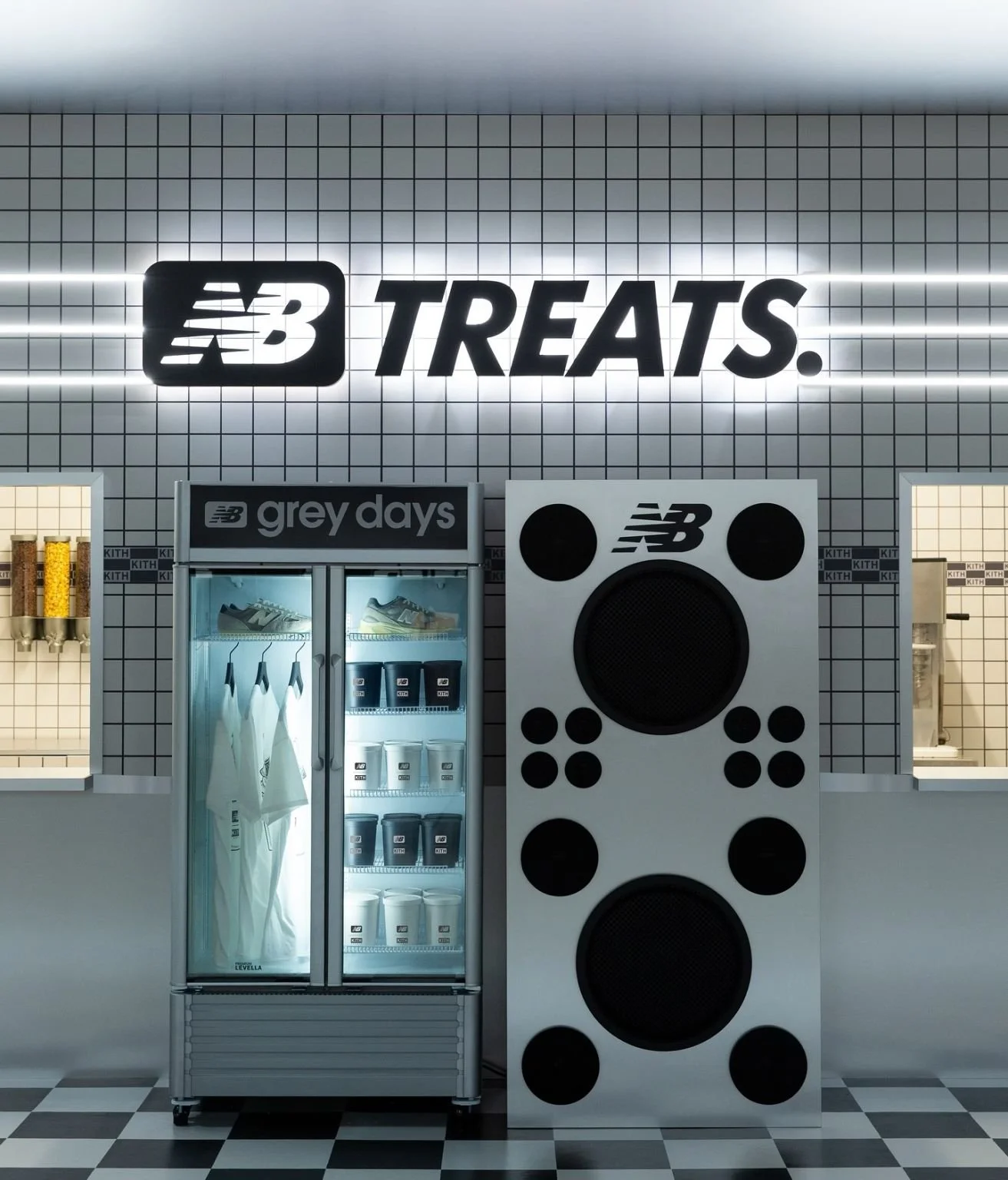
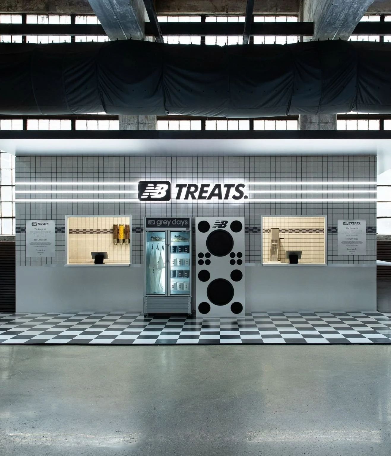
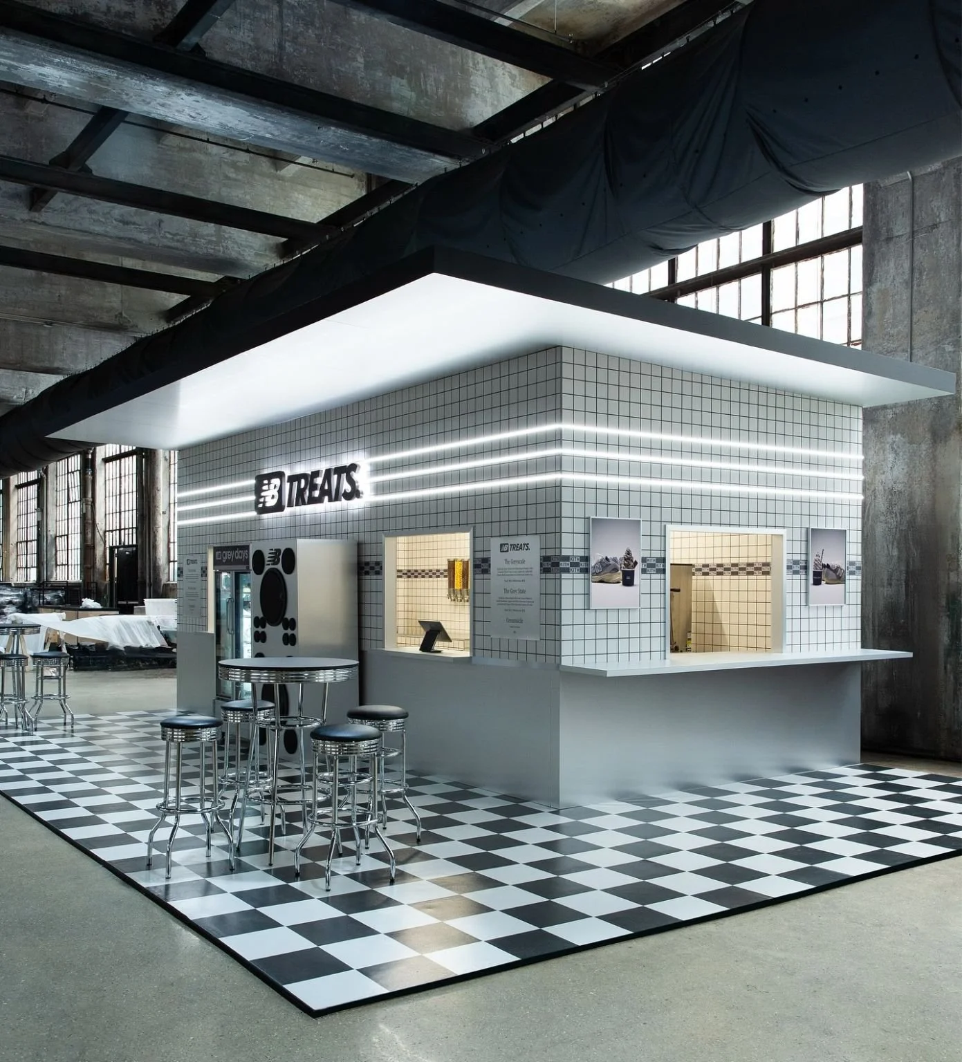
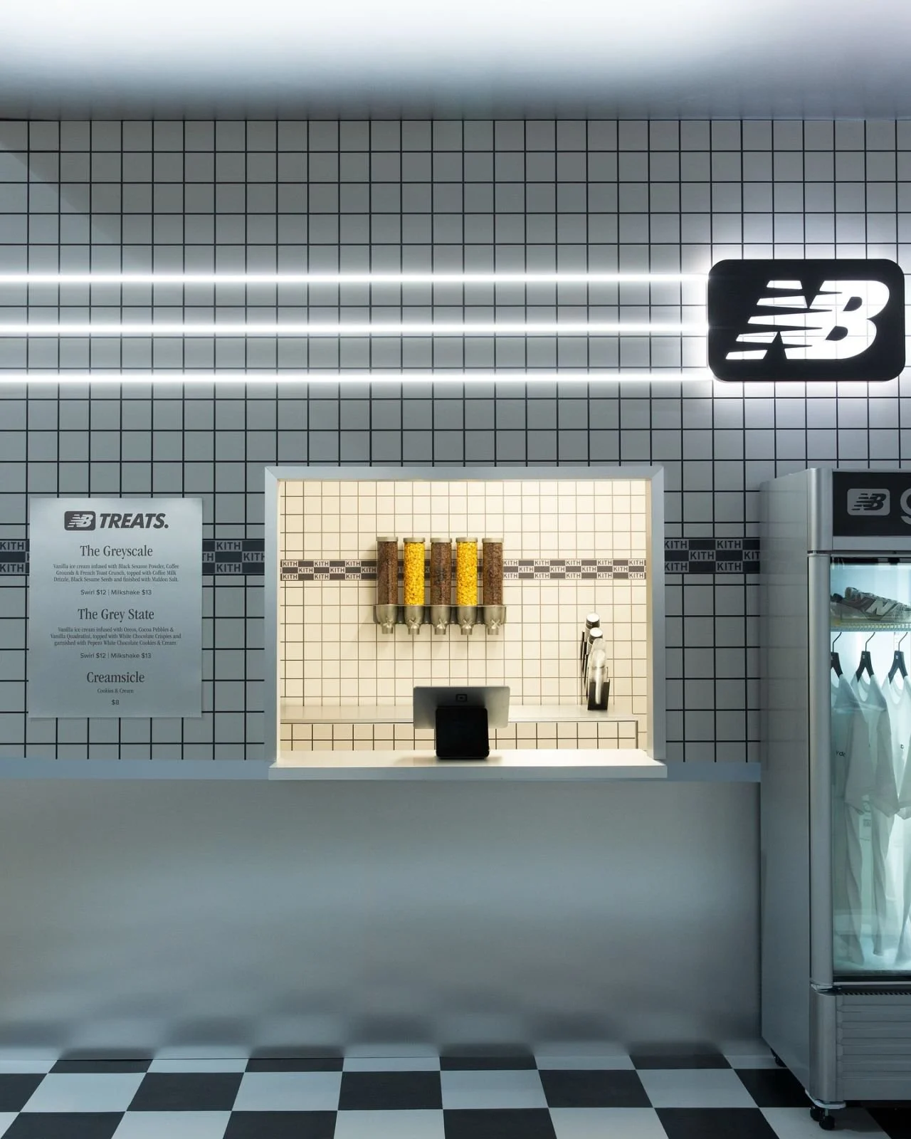
The heart of the activation was a diner-style pop up created with Kith Treats. Set against a backdrop of industrial architecture, the build was a sharp contrast: bright white tiles, glowing strip lights, and a black and white checkerboard floor. At first glance it felt like stepping into a retro American milkshake bar, but with every detail reimagined through the lens of New Balance grey.
From the illuminated NB Treats signage to the branded refrigerators and curated menu boards, the space blurred the line between food, fashion, and culture. It was more than just a build, it was an immersive retail installation designed to spark curiosity and create shareable moments.
The activation was available at Kith’s New York outlets and also popped up at Complex’s Family Style Food Fest, extending its reach to both a dedicated retail environment and a cultural festival audience. Visitors could not only see the collaboration, but taste it too, making the diner a cultural touchpoint, part experiential shop fit out, part gallery, part hangout.
Digital Amplification
What made the campaign even stronger was how the digital layer extended reach and deepened meaning.
Minimalist storytelling
Posts across Instagram, LinkedIn, and other platforms used strong visuals and pared back messaging. Taglines such as “A classic in the making” or “Grey has never” pulled people in by contrast. Grey is everywhere, but grey delivered like this is not.Collaboration spotlight
Creators and collaborators from fashion, street culture, and food pushed the narrative forward. The partnership with Kith Treats showed up not just in product, but in content, visuals, and even flavour. Grey was not just what you wear, it was what you taste, how you move, and where you gather.Consistency across channels
Both physical and digital environments held to the same principles of restraint, texture, and strong visual identity. Whether someone encountered grey in a pop up or on a screen, the same mood carried through, and it was unmistakably New Balance.
Why It Resonates
New Balance’s strength has always been its ability to balance heritage with relevance. Grey Has Never proves that brand activations do not need gimmicks to land. The campaign is shaped around these core ideas:
Reframe the obvious. Grey is not overlooked, it is reimagined.
Design with restraint. The absence of excess lets quality, material, and detail shine.
Collaboration as amplification. Bringing in cultural partners like Kith Treats does not simply extend reach, it adds context, flavour, and authenticity.
Coherence without uniformity. Grey tied everything together, but its expression flexed depending on medium, purpose, and collaborator.
The result feels both timeless and contemporary. True to New Balance’s roots, but impossible to ignore in today’s landscape where visual identity and cultural relevance matter as much as product.
Lessons for Brands
For other brands, Grey Has Never offers clear insight:
Own what others dismiss. Sometimes the most overlooked assets such as a colour become the most powerful when reinterpreted.
Let physical and digital be distinct but connected. Use offline spaces not just to showcase, but to feel. Use digital to amplify, tease, and deepen.
Collaborations matter, not just for reach but for narrative. A collaborator like Kith Treats does not just sell, it adds texture, connection, and story.
Leave room for interpretation. The more people can bring themselves into the activation, the more they make it their own.
Closing Thought
With Grey Has Never, New Balance demonstrates that the quietest statements often carry the most weight. By taking a colour most would overlook and making it iconic, they have not only enhanced a product line, they have reshaped the cultural conversation. And through collaboration with Kith Treats, they made that message tastable, experiential, and lived.
Lyra’s Perspective
Grey Has Never activation shows how heritage, collaboration, and restraint can create impact across physical and digital worlds. As a brand experience agency, our focus is on building moments that shift perception and spark culture, the kind of work that makes the everyday memorable.
If you are looking for a creative partner to bring your next brand activation to life, drop us a line.