McDonald's Unveils Its New Playful Global Packaging Redesign (2020 Update)
Images courtesy of ‘McDonald’s packaging redesign by Pearlfisher, 2021’
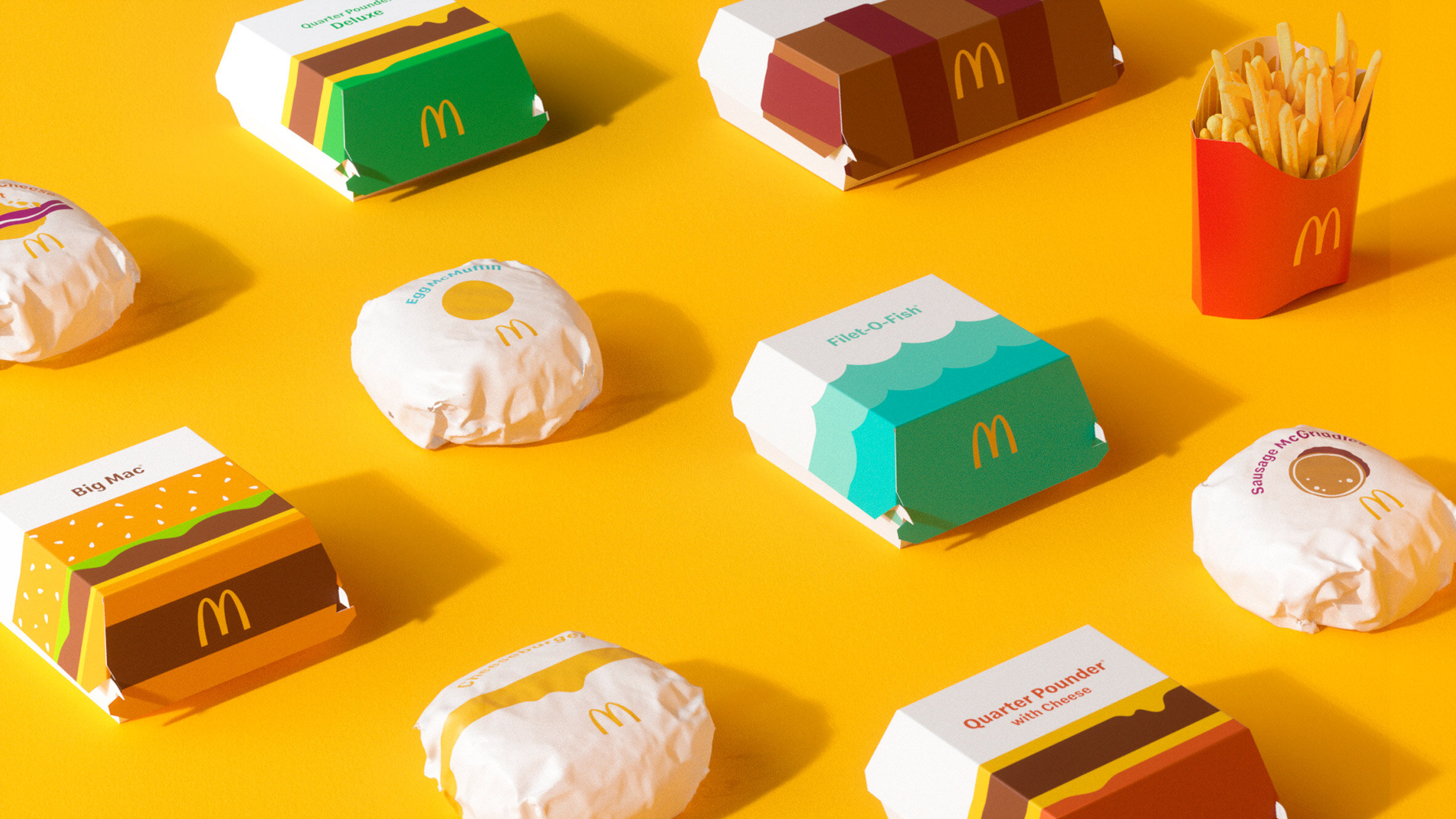
Independent agency Pearlfisher partnered with McDonald’s for a multi-year redesign of the brand’s global packaging system.
McDonald’s has updated their brand identity.
Consisting of a new graphics framework, the redesign seeks to add "a sense of joy and ease to the brand" by bringing "bold graphics" to the forefront of fast-food chain packaging. The redesign is a step away from its former packaging and design scheme, which featured distinctive on-pack messaging and a more typographical approach.
Each item will now be served in packaging featuring a vibrant and simple graphic design that reflects the food inside.
"We were very excited to have the opportunity to bring the innate joy of the McDonald's brand back into the packaging by allowing each unique menu item to speak for itself," said Hamish Campbell, executive creative director at Pearlfisher.

Images courtesy of ‘McDonald’s packaging redesign by Pearlfisher, 2021’
Focusing on new vector-style illustrations of classic items from the menu, each new packaging item heroes an ingredient from the stacking of bread, meat and cheese in the cross-section of a Big Mac to the yolk of an Egg McMuffin.
"The bold graphic representations of menu items help make each piece of packaging more connected and evocative of McDonald's' playful point-of-view while bringing delight and ease to the brand," Campbell said.

Images courtesy of ‘McDonald’s packaging redesign by Pearlfisher, 2021’
Matt Sia, creative director at Pearlfisher says the team tried to bring personality through simple illustrations to allow the packaging to be functional, easy to identify, aesthetically minimal and emotionally joyful.
“Everything in this system has a purpose and helps activate McDonald’s’ brand positioning to make delicious, feel-good moments easy for everyone,” he adds.
The redesigned packaging would replace the 'striking and in-your-face' packaging designed by Boxer, a branding agency, to serve as a 'mobile advertisement' for the fast-food chain that was launched in 2016.

Images courtesy of ‘McDonald’s packaging redesign by Pearlfisher, 2021’
A true revision and strategic alignment return to basics, capable of transforming the modern expression of the global icon and evolving brand perception. By striping down the essence of what works and removing the unnecessary, Pearlfisher’s work is more of a foundational rebuilding rather than a throwback. It also signals a step towards modernity for the brand.
McDonald's is the second fast-food chain to launch a new look this year since Burger King's first rebrand in 20 years making headlines in January. While both viewed the challenge differently, it is obvious that even established brands need to refresh their look and re-communicate who they are to consumers.

Images courtesy of ‘McDonald’s packaging redesign by Pearlfisher, 2021’
Take a look at our own Lyra Studios’ branding project we developed to ensure brand consistency across all of our channels.