The Brief.
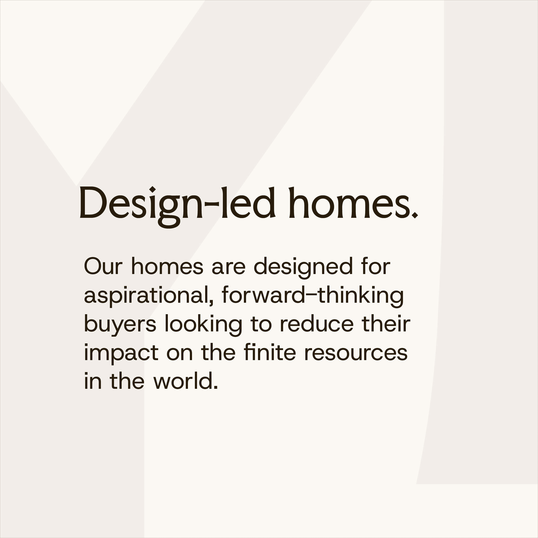
As a design-led business, Youngman Lovell needed their branding to look as considered and cohesive as the carbon-neutral homes they build. The goal was a slick, unified identity that reflected their high-end, sustainable ethos across every touchpoint.
The Solution.
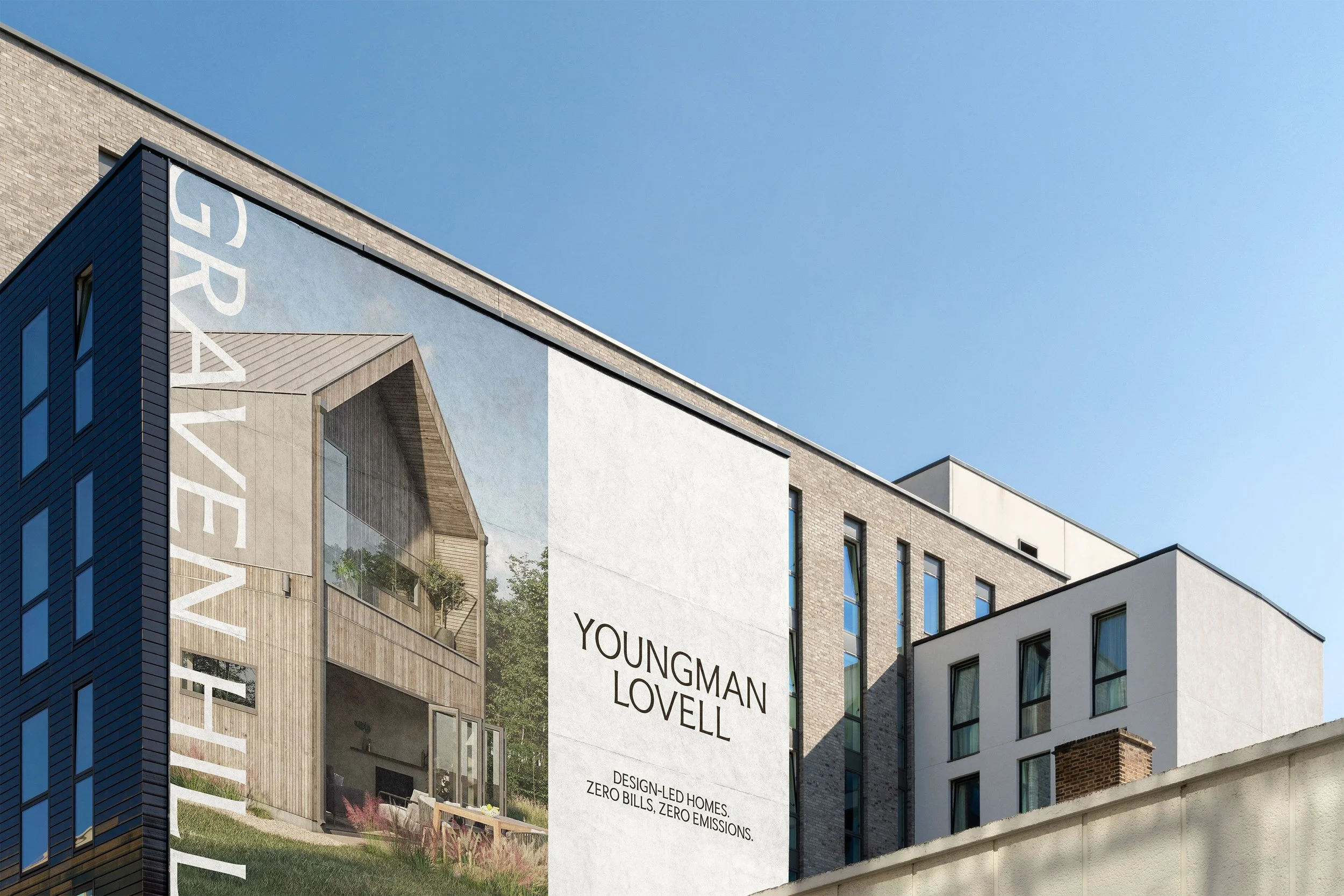
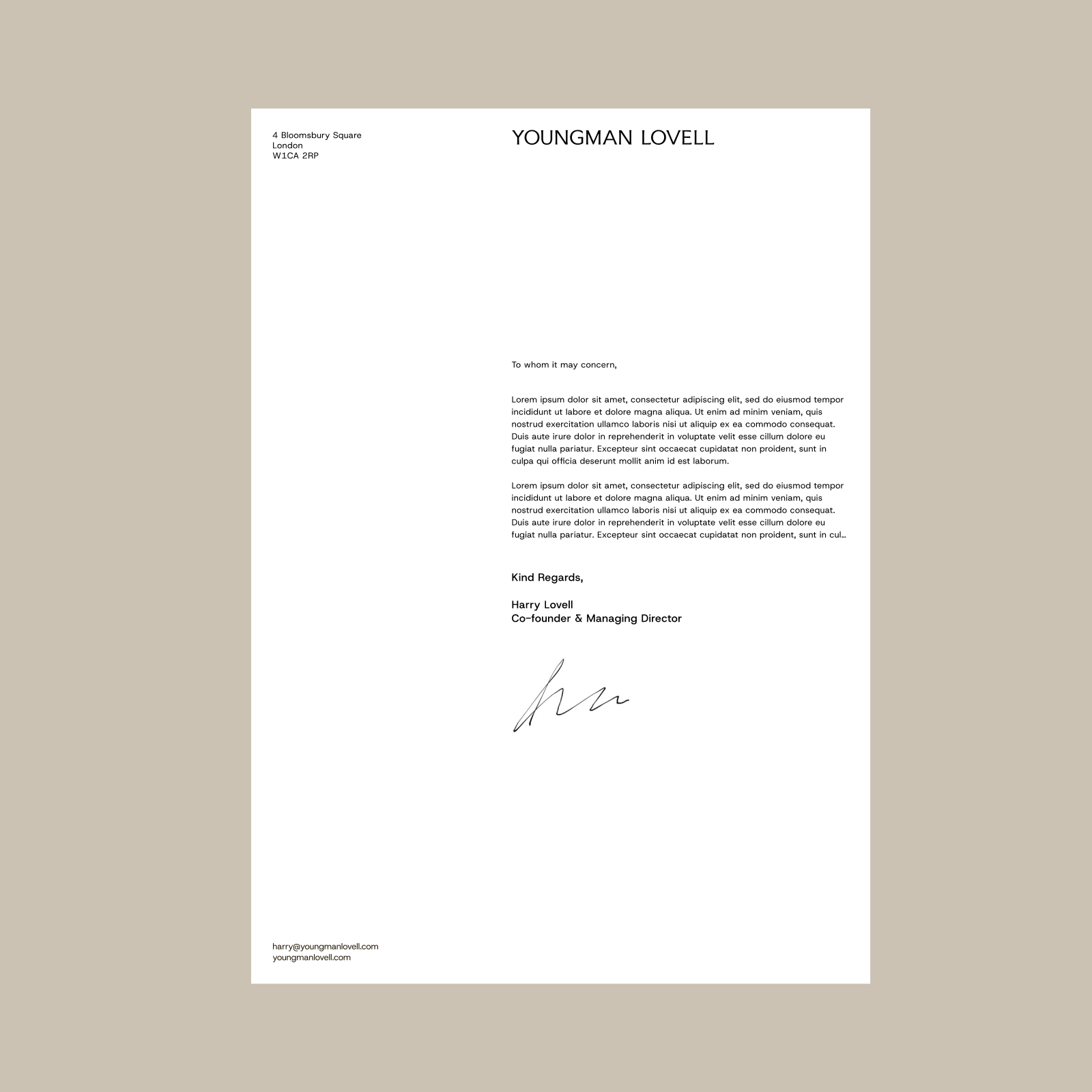
We delivered a complete brand refresh, revamping their visual identity, colour palette and typography. The new look was rolled out across everything from letterheads to their brand deck, ensuring every detail speaks to Youngman Lovell’s commitment to sustainability and design excellence.


Clean, confident, and architectural in proportion. Designed to hold space rather than shout, reflecting the brand’s quiet strength and timeless sensibility.

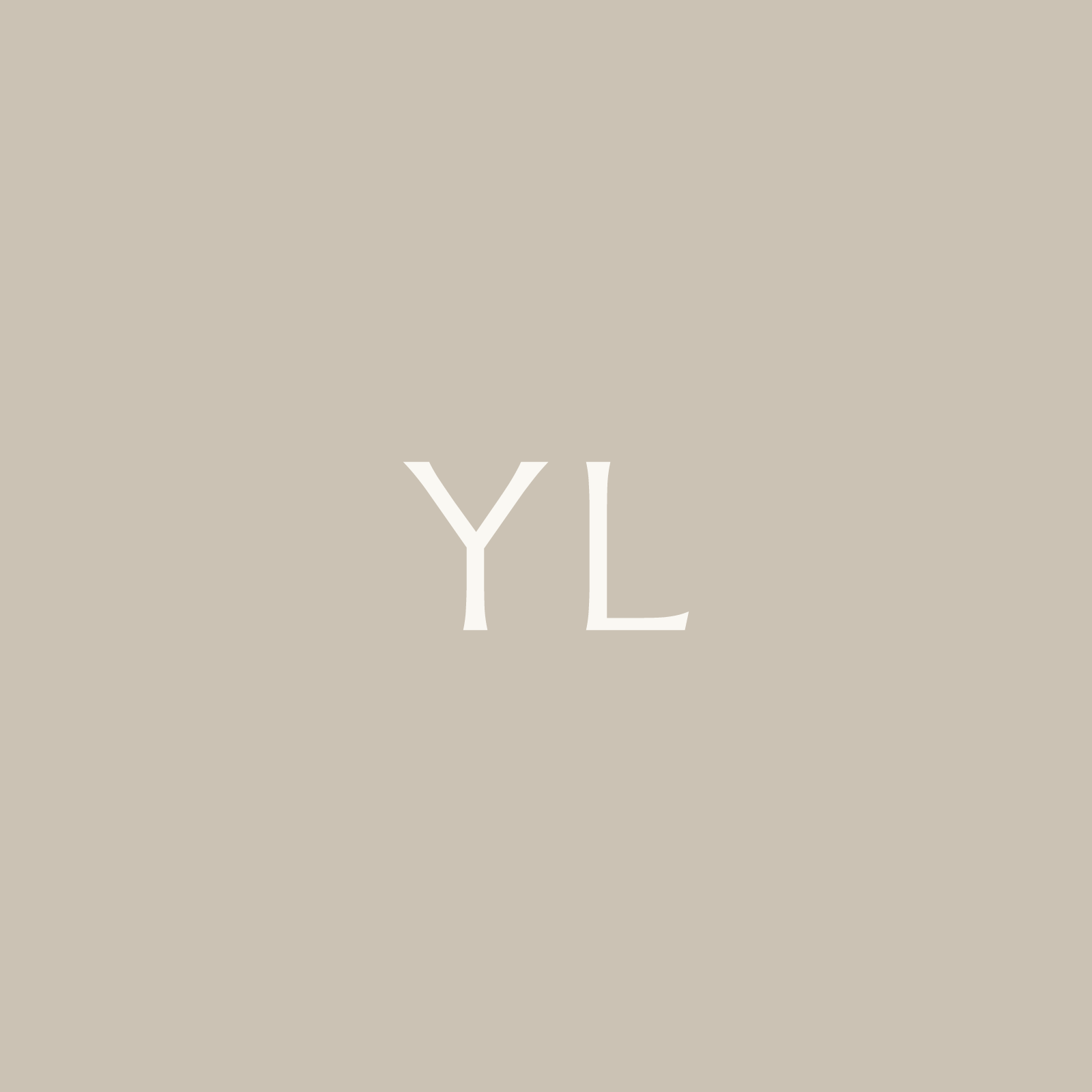
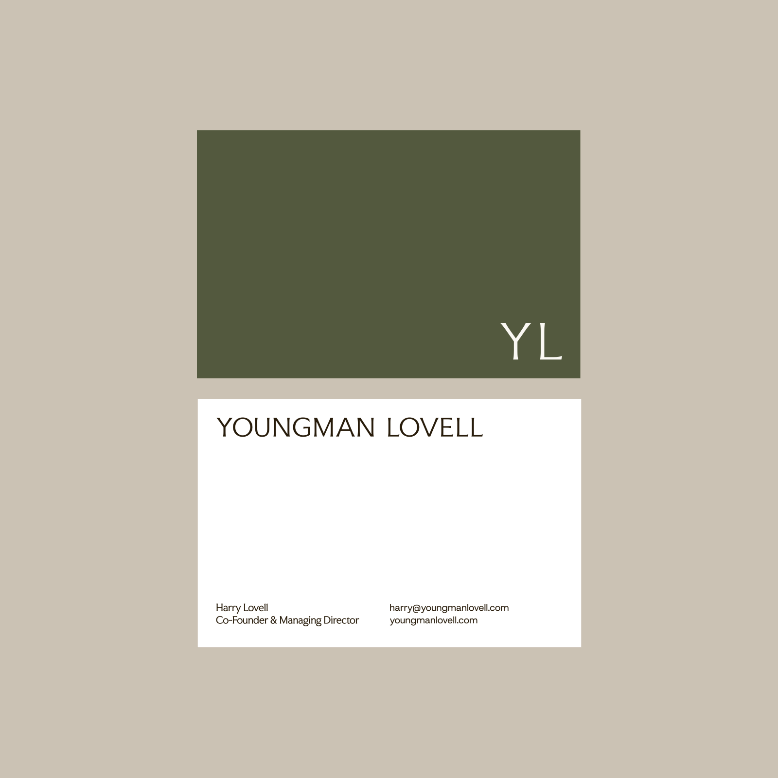
A monogram built on structure and balance. Inspired by the precision of joinery and the permanence of architecture.

A refined serif pairs with a functional sans to balance warmth and precision. It mirrors YL’s design philosophy, thoughtful, honest, and built to last.
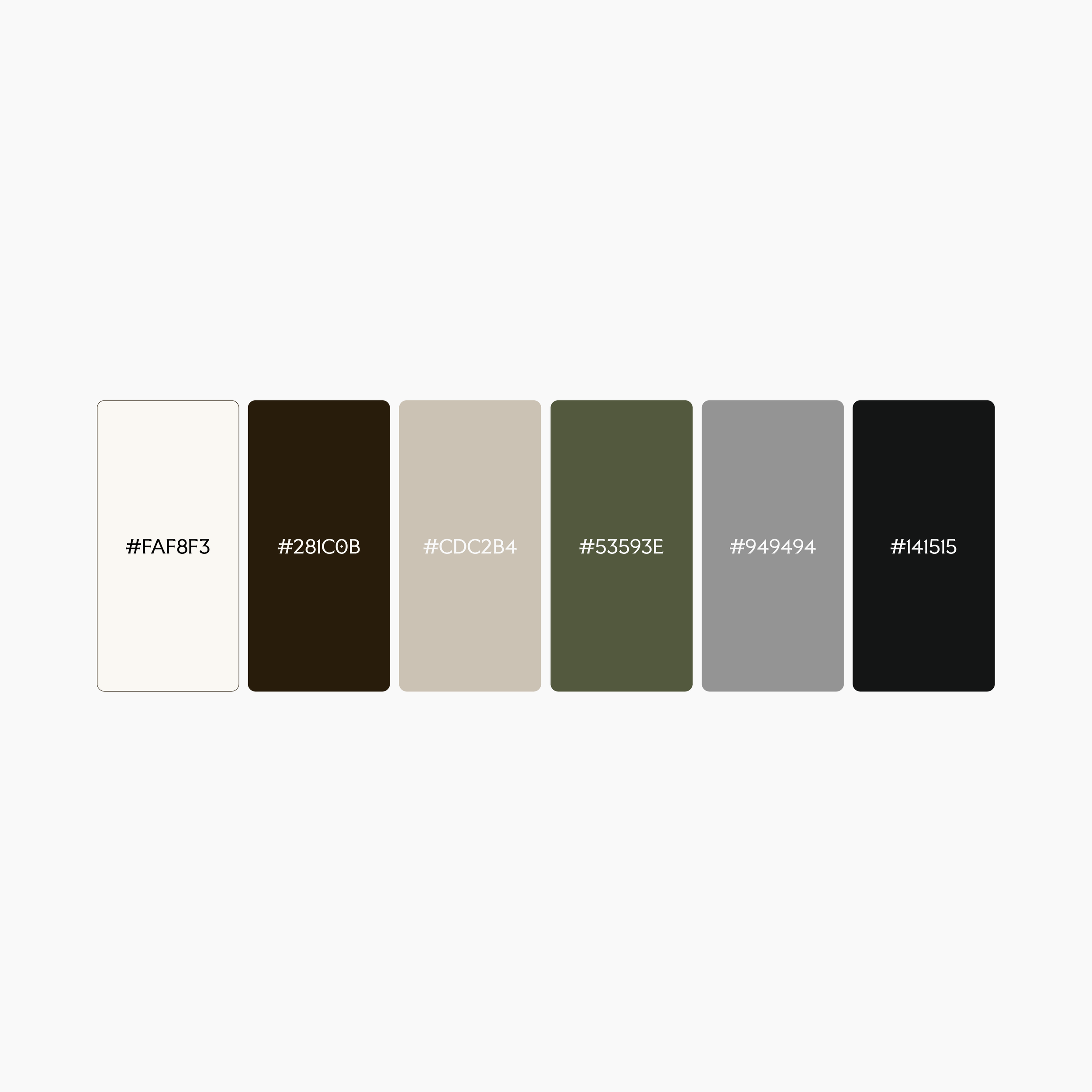
Drawn from natural materials: timber, stone, and clay, the palette grounds the brand in calm, tactile tones.


Ready to kick-start your project.
We'd love to chat about how we can help. Whether you have a concrete plan or a budding idea, book a discovery call with our co-founder, Will.