Find Out Why Euan Blair's $44 Million Startup, Multiverse, Is Given A New Brand Identity In 2021
What does the son of a former Prime Minister who pledged to send 50% of young people to university do? Create a startup dedicated to apprenticeships!
Having recently accumulated $44 million in financial backing, Tony Blair's son Euan has renamed and rebranded his startup, Multiverse, with the help of Koto. Koto "Help the world’s best brands become even better."
The designs aim to display alternative avenues to work and give greater consideration to individuals versus organisations.

A significant roadblock to diversifying workforces is the outdated picture of what the course to industry looks like.
Numerous large companies are abandoning their degree requirements for jobs and looking for apprenticeships and work-based learning schemes to find their newest employees.

This partly demonstrates why Multiverse, formerly named Whitehat due to its association with hacking (hacking the system), was able to raise such a formidable amount of funding and has clients including Google, Facebook and Sky.
A proportion of the funding was allocated to the rename and rebrand by Koto, which is inspired by “endless possibilities”.
If you skip to 5:57 of the linked video you can hear Euan Blair's full explanation.
The main crux of rebranding Multiverse was to personify its alternative stance on education and stand head and shoulders above the competition in the education and education-technology worlds.
Whitehat “didn’t really capture the energy or make the company stand out from the competition,” says James Greenfield, founder and creative director of Koto.

The updated brand identity now aims to make people take note “through its power” and then hold their attention with its bold visual contrast compared to the competition.
“To build an alternative you have to show you’re an alternative to something,” Greenfield stated.
“In the long run the brand’s actions will be associated with its visual brand and so it will become a shorthand.”

The main focus of the brand identity is to embody Multiverse's mission, which is to reveal more routes to work than university alone.
They strive to “create a more diverse group of future leaders”.
Greenfield continued:
“We wanted to signify the brand’s intent to change thinking around the world of education and work."

The brand’s character is illustrated by the different elements of the design. Greenfield goes on to say:
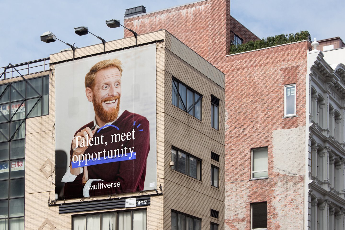
“Optimism in the colour, graphic style and tone, inclusivity in the photography and tone of voice, resolute in the power of the brand as a whole."
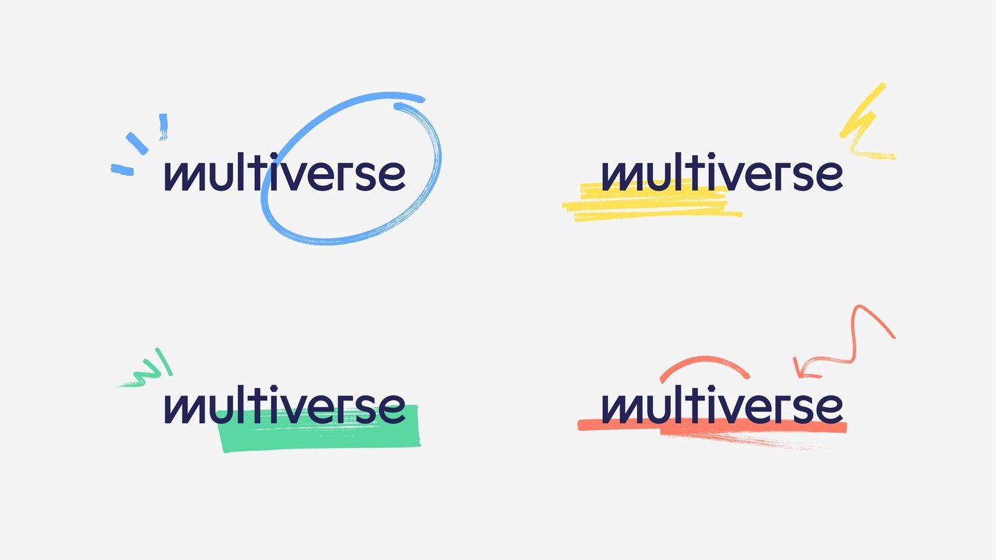
The new brand identity uses bright, rich hues to stand out “against a sea of blue and sameness,” Greenfield explains the visual comparisons of Multiverse's competition, with a collection of illustrative details.
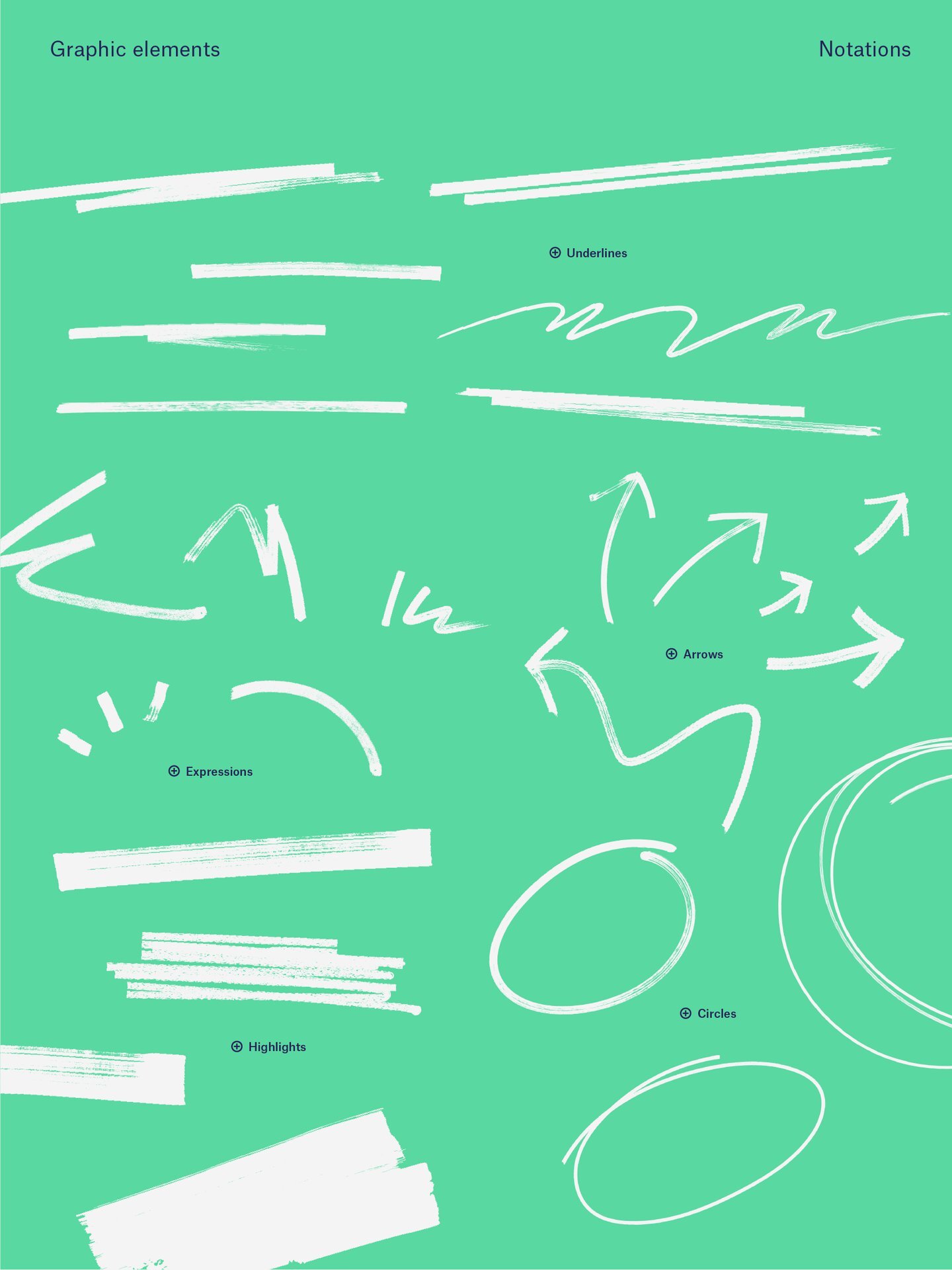
The bold, lively doodles embellish the branding and provide a kick of energy and personality.
The doodles are especially useful in emphasising valuable information – “the new brand is intentionally more personal,” he adds.
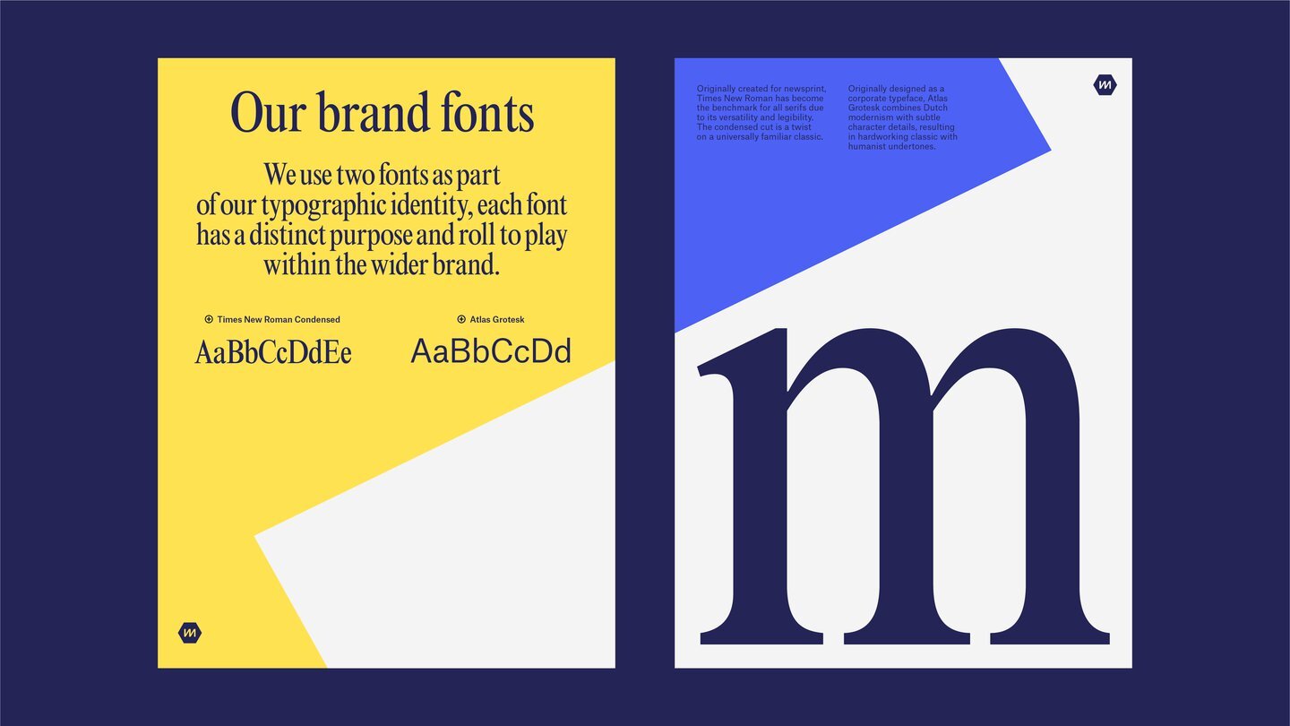
The design system uses a pair of typefaces to work off each other: one serious (Times New Roman Condensed) and one more modern (Atlas Grotesk).
The logotype is comprised of various characters from multiple typefaces, feeling diverse but remaining understandable.
“A multiverse is defined as a 'space or realm consisting of a number of universes, of which our own universe is only one," says Greenfield.

Koto achieved this feel in their photography, messaging, tone of voice and most importantly the logo.
“[It] is multi-state and animated by nature, feeling pretty diverse and made up of many styles intentionally.”
Check out our thoughts on McDonald's and Burger King's new brand identity.
Images courtesy of Koto: Multiverse brand identity (Copyright © Multiverse, 2021)