The Brief.
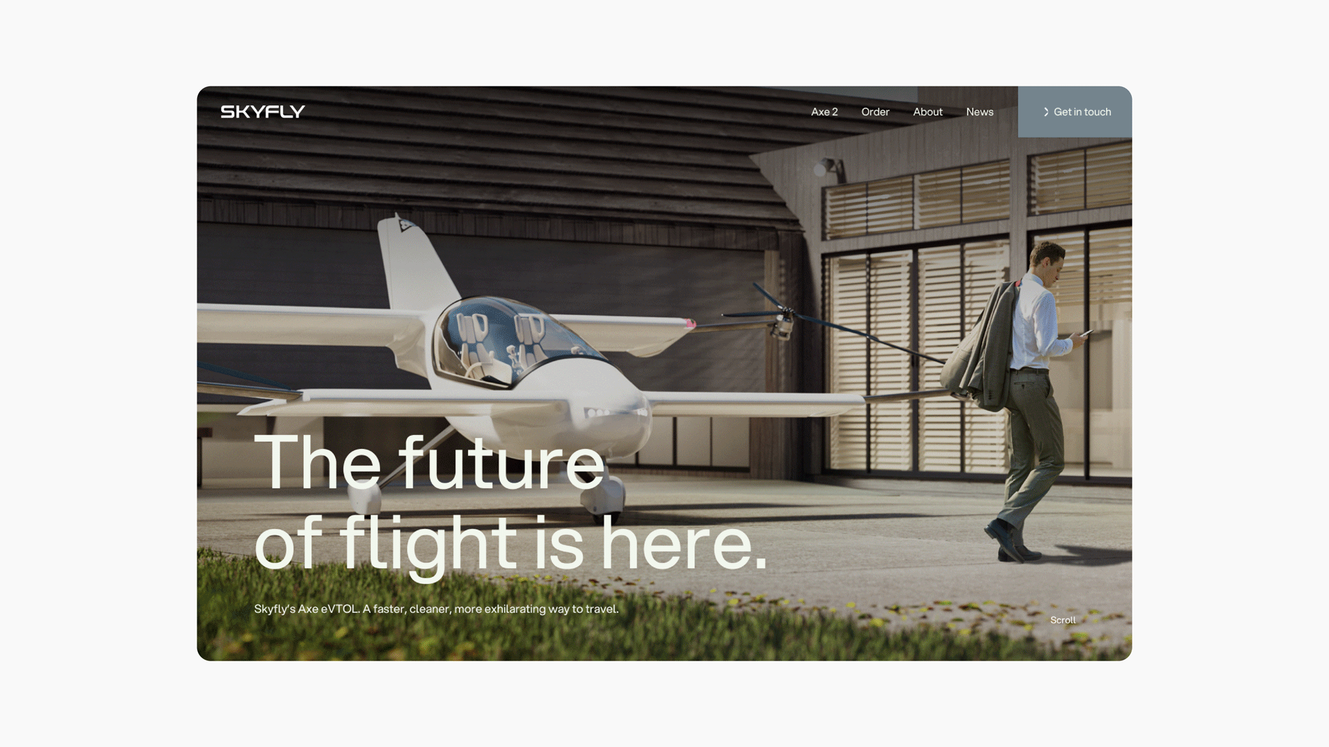
Skyfly are pioneering personal aviation with their two-seat eVTOL aircraft, the Axe. They wanted a brand world and digital presence to match their ambition. They needed something premium and reassuring for early adopters entering a new category of flight.
The Solution.
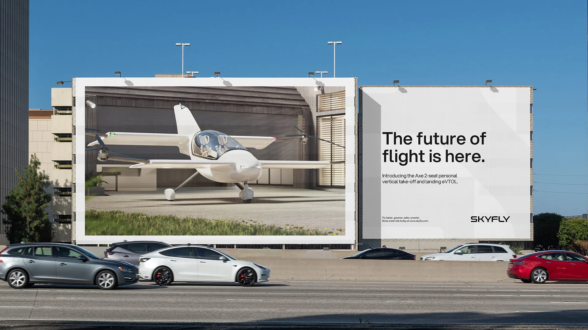
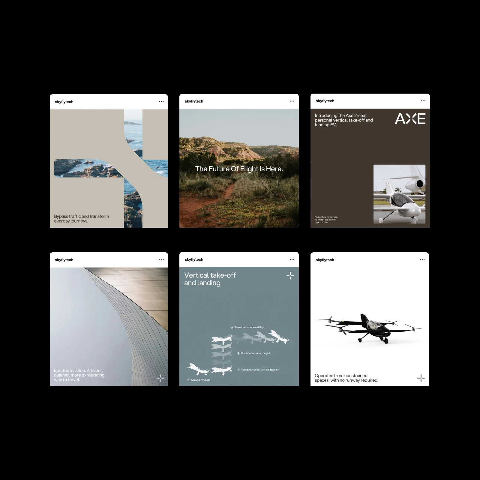
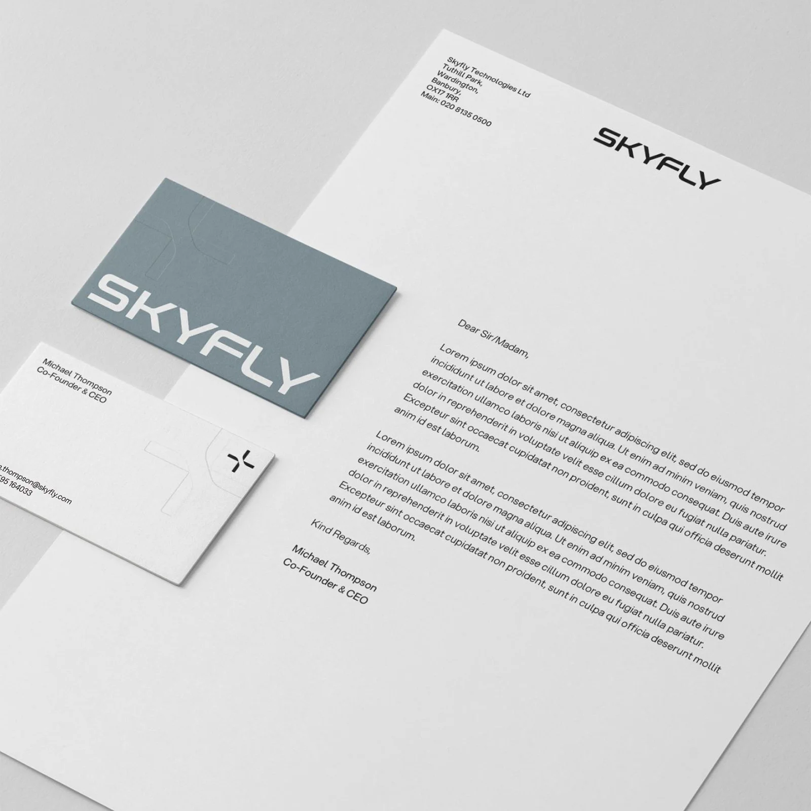
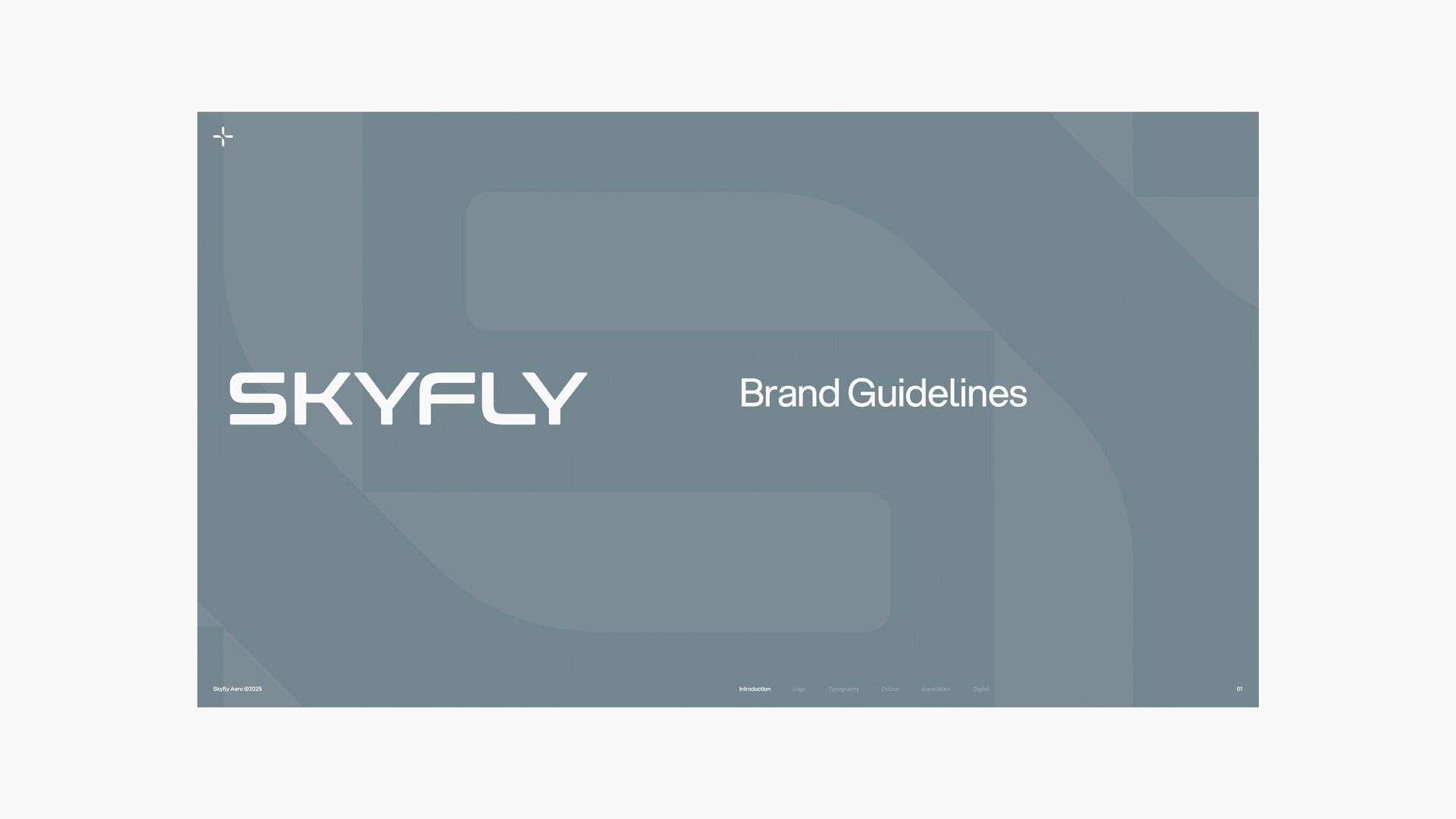
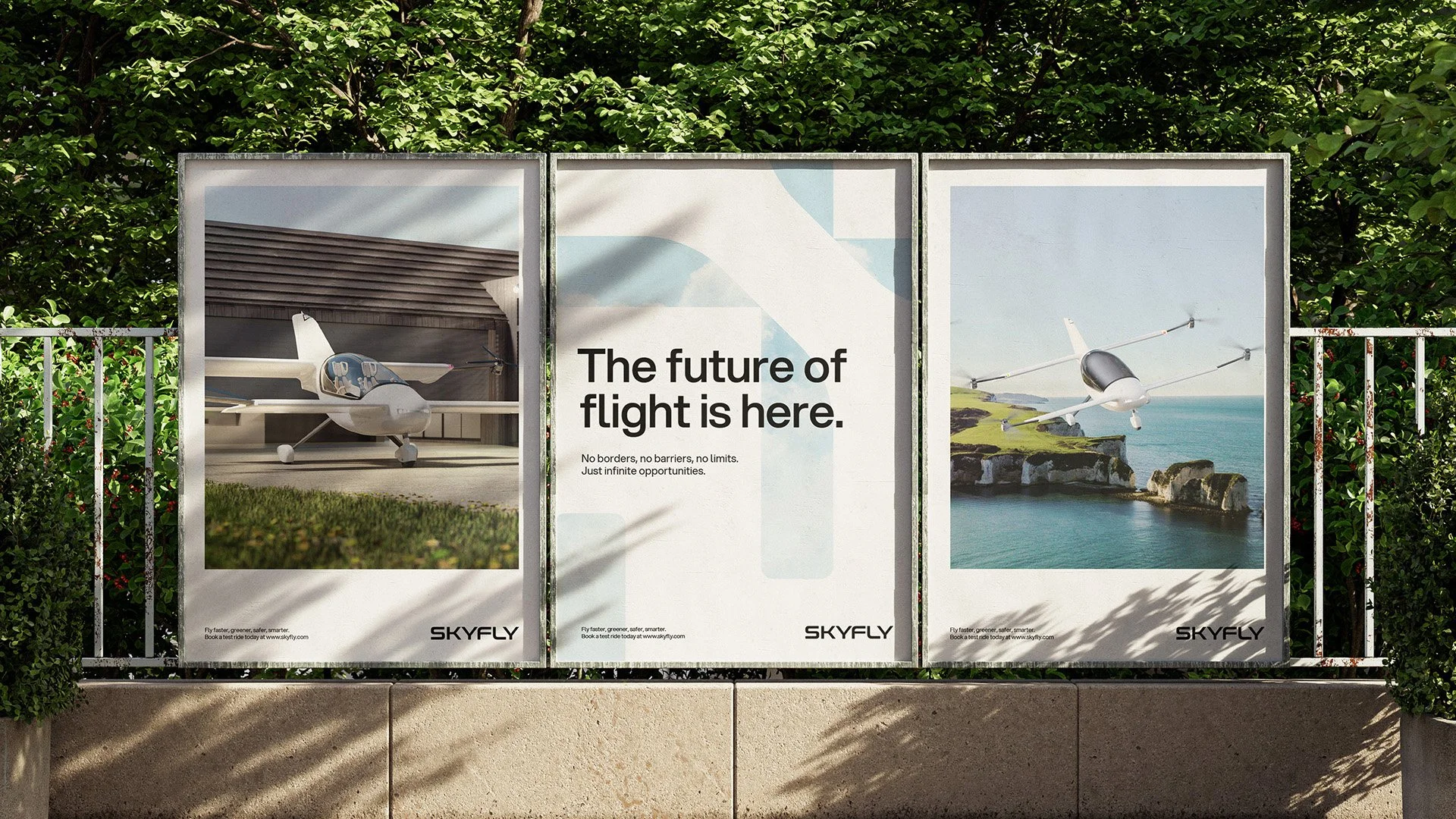
We delivered a full rebrand for Skyfly, including brand guidelines that defined tone of voice, messaging pillars, and visual identity. The result is a brand that is fitting for the cutting edge nature of their business. To bring it to life, we designed and built their new website, creating a sleek digital hub that showcases the Axe, its features, and the future of personal air travel.
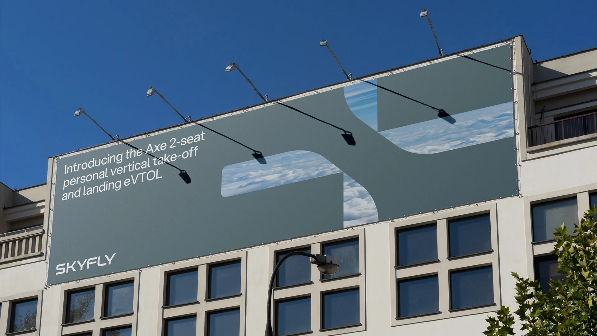
The Skyfly brandmark directly reflects the design of the Axe 2 propellor design. It has the visual look as the logotype to allow it to sit separately but still be recognised.

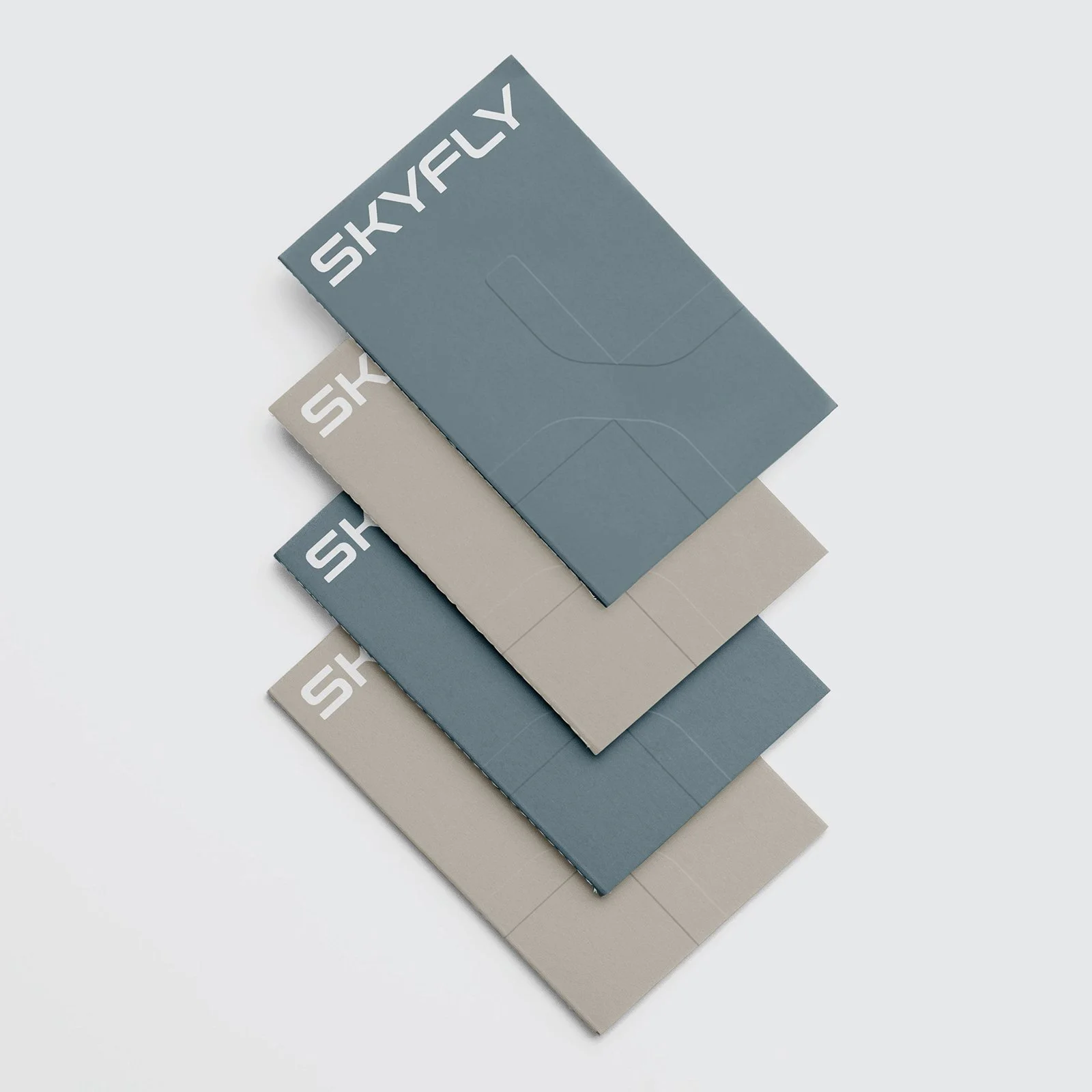
Skyfly’s brandmark scales infinitely, working effectively on a large scale for backgrounds and on a small scale to lead a line of copy.
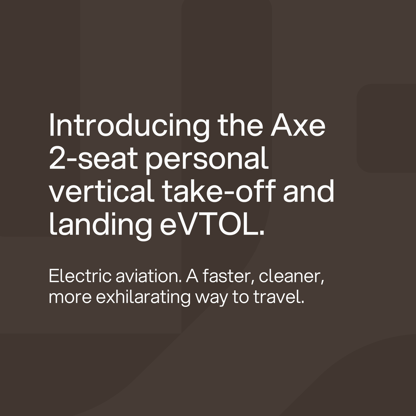
A versatile sans-serif font with character and tech feel that ties in with the engineering roots of the company.

A neutral, modern colour palette creates a sense of balance with the propeller pattern and masked images. These colours can be use tinted at seventy to forty percent.


Ready to kick-start your project.
We'd love to chat about how we can help. Whether you have a concrete plan or a budding idea, book a discovery call with our co-founder, Will.